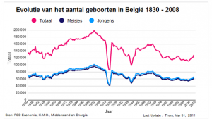
A few weeks ago I gave students (18+) this graph on a test:
In this graph the evolution of births in Belgium (between 1830-2008) is given. Among other questions I asked them if they could explain the two low points (nadirs) in the graph. Very few students succeeded in giving some sort of acceptable explanation. I got a lot of answers like this one: “How am I supposed to know, I wasn’t born yet”. I found this very disappointing. It might not be a strictly mathematical question, but connecting the maths to a little common knowledge should be possible.
Browsing through Mr. Barton’s website (a very interesting website for maths teachers) I discovered the Google Ngram Viewer. It doesn’t do exactly what I asked on the test but you can use it to link some common facts or history to graphs. With this website you can search for the relative frequency of any of the words within the 5,2 million books (from the last 200 years) that Google has access to. You just put in the words (for example radio, television, internet) and watch the graph appear. You can do some together with your students so they get the hang of it. What I then did was make a few graphs at home with clear high and low points, effaced the words (for example in Paint) and let the students in the classroom guess what words I put in.
Another Google website that is great to do exercises like this with is the Google Public Data Explorer. You can put two variables (X and Y axis) in and it generates the graph. Maybe here you can efface one of the axis titles and let students comment. Also interesting questions like” Is adult literacy a good indicator of life expectancy?” can be discussed.
Yet another interesting website for graphs and numbers is NationMaster. With this website you can compare two (or more) countries on several variables. This is great for collecting data or maybe trying to make some predictions on chosen variables and countries. There is also the possibility to see a map with the results and it calculates correlations.
Katleen Vanden Driessche


 English
 Nederlands
 Deutsch
 Italiano
 Español
 Português
 Română
 Cymraeg
Loved these ideas!
Thank you Jen, I also think it’s quite interesting to combine graphs with the reality of the outside world. It gives the number crunching something extra